最近看张鑫旭前辈的博客,感觉又找回最开始学习HTML&CSS时候的感觉,好玩有趣;然后就想起了一直听过但没写过的网格布局,记录一下。
网格布局
- 和弹性盒子(flex)一样官方提供的方便布局的新属性 display:grid
- 如名字一样,开启该属性后会将目标dom设置成由一个一个单元格组成的一个布局容器
基本概念
- 容器:开启了grid的dom;内部由数个单元格组成
- 行:单元格水平排列
- 列:单元格纵向排列
- 网格线:容器下的每个项目都分布在每个单元格中,开发这模式可以看到该线
基本使用
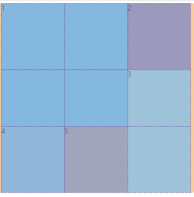
demo1
- 效果:
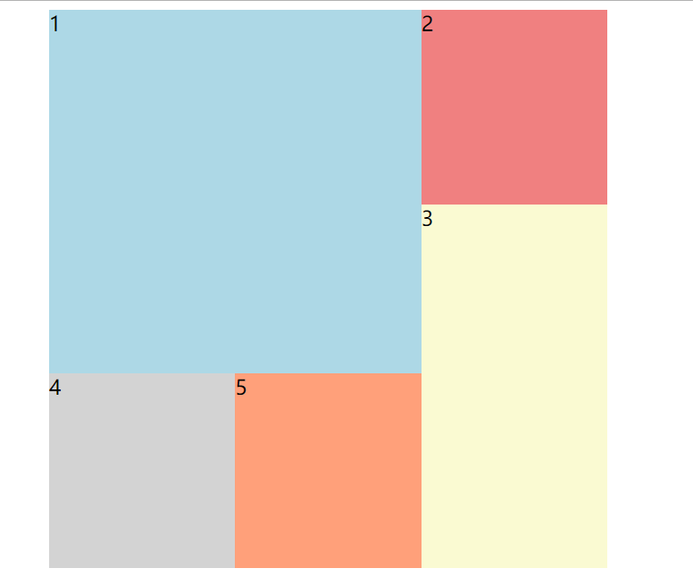
- 说明:特殊的布局
<style>
  #app {
    width: 500px;
    height: 500px;
    margin: 0 auto;
    /* 开启网格布其 */
    display: grid;
    /* 定义单元格名称以及在容器中的分布 */
    grid-template-areas: "a a b" "a a c" "d e c";
  }
  #app > div:nth-child(1) {
    /* 定义当前单元格在容器中的分布区域 */
    grid-area: a;
  }

  #app > div:nth-child(2) {
    grid-area: b;
  }

  #app > div:nth-child(3) {
    grid-area: c;
  }

  #app > div:nth-child(4) {
    grid-area: d;
  }

  #app > div:nth-child(5) {
    grid-area: e;
  }
</style>
<body>
  <div id="app">
    <div style="background-color: lightblue;">1</div>
    <div style="background-color: lightcoral;">2</div>
    <div style="background-color: lightgoldenrodyellow;">3</div>
    <div style="background-color: lightgrey;">4</div>
    <div style="background-color: lightsalmon;">5</div>
  </div>
</body>
demo2
- 效果:
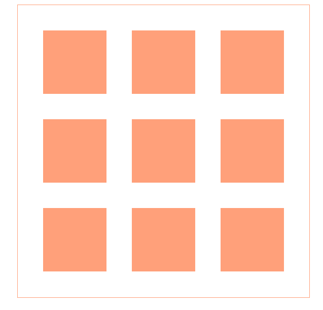
- 说明:一个九宫格,里面每个单元格之间的间距都是一样的
<style>
  #app {
    width: 420px;
    height: 420px;
    padding: 20px;
    margin: 0 auto;
    /* 开启grid */
    display: grid;
    /* 设置有几行 每一行的宽度 */
    /* repeat是提供的一个方便书写的函数 第一个参数为设置几行(列)第二个参数为具体的值 */
    grid-template-rows: repeat(3, 140px);
    /* 同理 列 */
    grid-template-columns: repeat(3, 140px);
    /* 设置单元格内的元素排列方式 和flex类似 */
    align-items: center;
    border: 1px solid lightsalmon;
  }

  #app > div {
    width: 100px;
    height: 100px;
    margin: 0 auto;
    background-color: lightsalmon;
  }
</style>
<body>
  <div id="app">
    <div></div>
    <div></div>
    <div></div>
    <div></div>
    <div></div>
    <div></div>
    <div></div>
    <div></div>
    <div></div>
  </div>
</body>